Warm vs Cool Tones in Interior Design: Expert Guide to Choosing the Right Color Palette
Warm vs Cool Tones in Interior Design: A Complete Guide to Color Balance
Choosing the right colors is one of the most important decisions in interior design. The tones you select not only affect the aesthetics of your home but also influence mood, comfort, and the way a space feels. When we talk about warm vs cool tones in interior design, we’re diving into the psychology of color and how it transforms a room.
Warm tones evoke feelings of coziness, energy, and intimacy, while cool tones promote calmness, relaxation, and spaciousness. Understanding how these tones work, their benefits, and how to use them effectively can elevate your home into a perfectly balanced environment.
Understanding Warm Tones in Interior Design
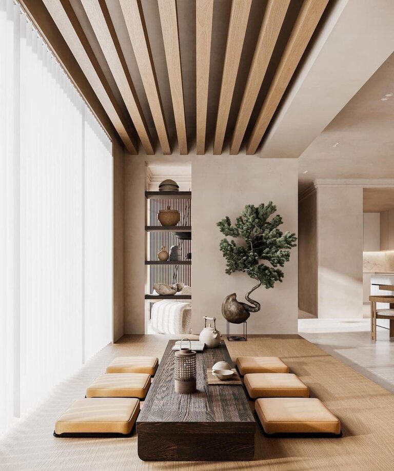
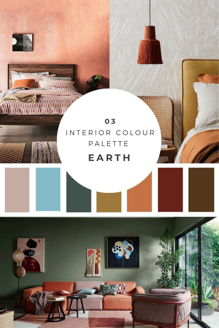
Warm tones are colors that remind us of heat, sunlight, and fire. They typically include shades like red, orange, yellow, and earthy browns. These tones create an inviting and cozy atmosphere, making them ideal for spaces where people gather and interact.
The beauty of warm tones is that they can instantly make large rooms feel more intimate. A living room painted in warm beige, terracotta, or muted gold can feel comforting and welcoming. Designers often use warm tones in social spaces because they stimulate conversation and energy.
Psychological Impact of Warm Tones
Warm tones are powerful emotional triggers. Shades of red can energize and excite, while yellows often bring optimism and cheerfulness. Browns and earthy shades add stability and a grounded feeling.
By choosing warm tones, you create a living space that feels vibrant and full of life. They are especially useful in colder climates because they counterbalance the environment by adding a sense of warmth indoors.
Exploring Cool Tones in Interior Design

Cool tones are associated with water, sky, and nature. These include shades like blue, green, lavender, and cool greys. They are often used to create calming, refreshing, and spacious environments.
Designers love using cool tones in bedrooms, bathrooms, and offices because they encourage relaxation and focus. For example, a soft blue wall in a bedroom can make it easier to unwind, while muted greens in an office promote concentration.
Psychological Impact of Cool Tones
Cool tones provide a soothing effect that helps reduce stress and anxiety. Blue tones are known for their calming qualities, while greens offer balance and renewal. Cool grey, on the other hand, adds elegance and sophistication without overwhelming the senses.
These shades are excellent for homes in hot climates because they naturally make spaces feel cooler. A well-balanced cool-toned interior gives the impression of freshness and tranquility.
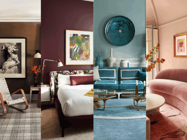
Key Differences Between Warm and Cool Tones

The contrast between warm and cool tones lies in their emotional and physical effects. Warm tones make rooms feel smaller, cozier, and more intimate, while cool tones make spaces appear larger, calmer, and more open.
Warm tones are best for social and interactive spaces like living rooms, dining areas, and kitchens. Cool tones, on the other hand, are better suited for private, restful spaces like bedrooms, bathrooms, and meditation corners.
Understanding when to use each is the foundation of creating balanced interior design.
Real-World Examples of Warm vs Cool Tones
To better understand how warm vs cool tones in interior design work in practice, let’s explore some real-world examples of products and design approaches that highlight these tones.

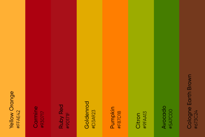
Benjamin Moore’s Aura collection includes an extensive range of warm shades like terracotta, golden beige, and muted orange. These paints are known for their rich pigmentation and durability, making them a favorite among professional designers.
The warm tones from this collection are perfect for living rooms or dining areas, adding vibrancy and depth. When paired with wooden furniture and warm lighting, the atmosphere becomes instantly cozy and welcoming.
Relevance: This product showcases how premium-quality paints can bring out the richness of warm tones, ensuring your living spaces feel both elegant and inviting.
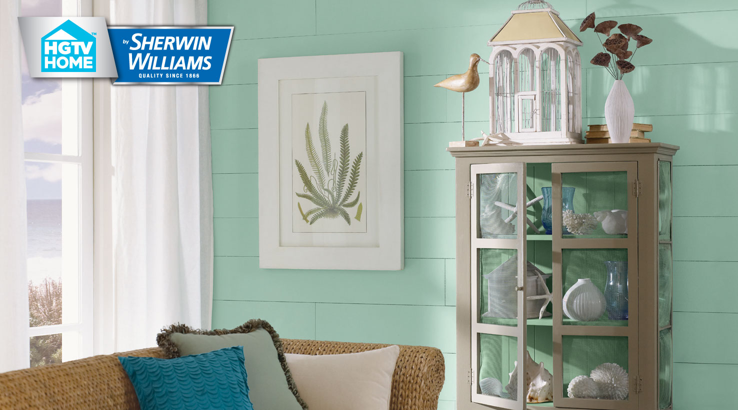
Sherwin-Williams offers curated palettes, and their Coastal Cool collection features shades like light blue, aqua, and soft grey. These tones are designed to mimic the refreshing feel of oceans and skies.
This palette is particularly effective in bedrooms or bathrooms, where relaxation is key. Light blue walls paired with white trims create a serene, spa-like environment, perfect for unwinding after a long day.
Relevance: This example demonstrates how cool tones can transform everyday spaces into calm retreats that enhance mental well-being.
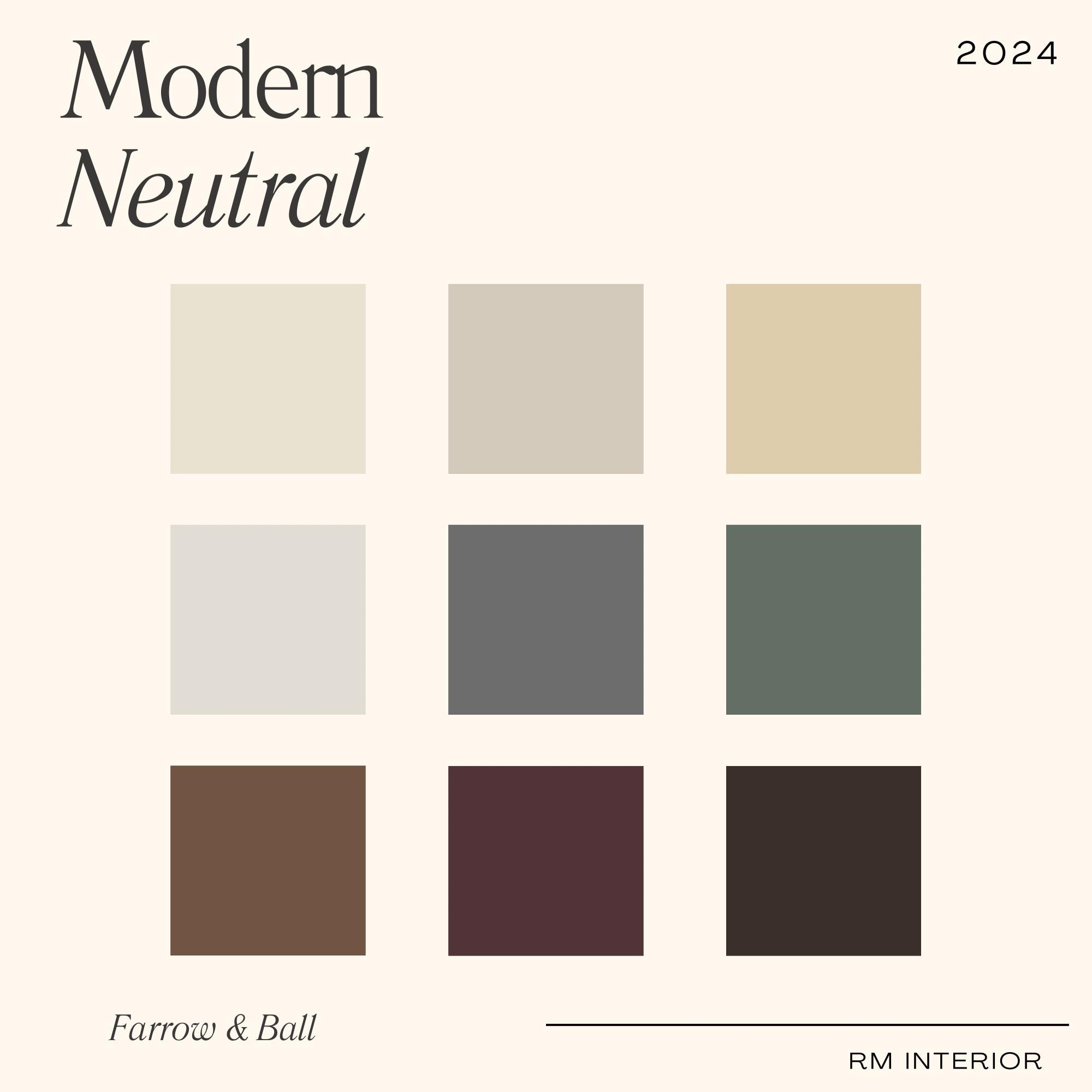
Farrow & Ball specializes in eco-friendly paints, and their earthy neutral shades like Ochre, Burnt Sienna, and Warm Taupe are excellent examples of warm tones in action. These colours work beautifully in open-plan living areas or kitchens.
When combined with natural materials like stone countertops and wooden cabinets, they create a rustic yet contemporary look. These tones also complement warm lighting, further enhancing their inviting appeal.
Relevance: This real-world palette illustrates how warm tones connect interiors to nature, creating a grounded and timeless design.
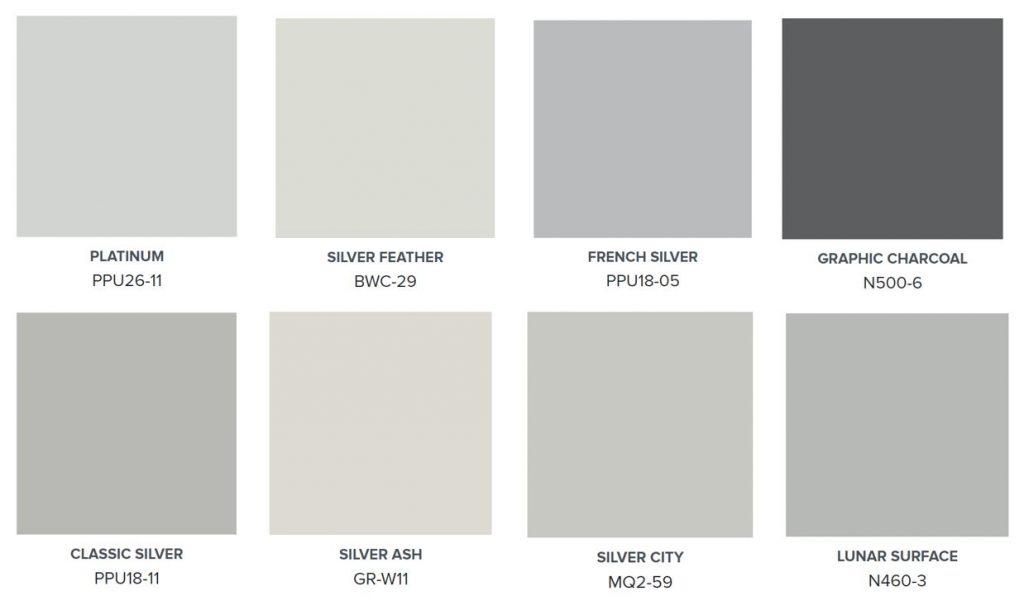
Behr’s cool grey shades are widely popular for modern interiors. Ranging from soft dove grey to charcoal, these tones offer versatility and sophistication. They are often used in minimalist or contemporary living rooms.
Cool greys act as a neutral backdrop, allowing vibrant furniture and artwork to shine. At the same time, they add a calming balance, ensuring the room doesn’t feel overwhelming.
Relevance: This example highlights how cool tones can serve as both a statement and a subtle foundation in modern interior design.
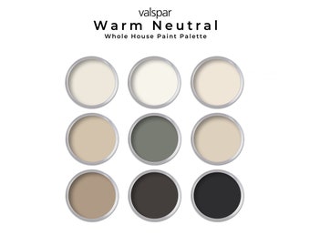
Valspar’s curated palettes often include a mix of warm and cool shades to help homeowners strike the perfect balance. Their collections allow designers to create harmony, such as pairing a warm beige wall with cool blue accents.
This combination ensures that no space feels too intense or too cold. It’s ideal for family homes where different moods need to coexist within the same environment.
Relevance: This example demonstrates how blending warm and cool tones can create versatile interiors that adapt to various activities and atmospheres.
Benefits of Understanding Warm vs Cool Tones
When homeowners and designers understand the differences between warm and cool tones, they can make informed choices that improve both aesthetics and functionality.
-
Enhanced Mood Control: Warm tones energize and inspire, while cool tones calm and soothe. Using them strategically allows you to design rooms for specific purposes.
-
Improved Space Perception: Warm tones make large areas feel cozier, while cool tones expand small rooms visually.
-
Balanced Design: Combining warm and cool tones creates dynamic yet harmonious interiors.
-
Versatility: Once you know how tones affect mood and space, you can experiment confidently with furniture, lighting, and accents.
Practical Use Cases of Warm and Cool Tones
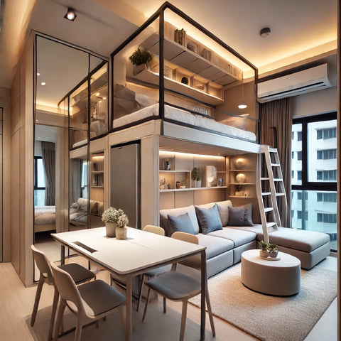
1. Small Apartment Living Rooms
Cool tones like light grey or pastel blue can make compact living rooms appear larger and more open. When combined with mirrors and natural light, the effect is even more pronounced.
2. Cozy Family Dining Rooms
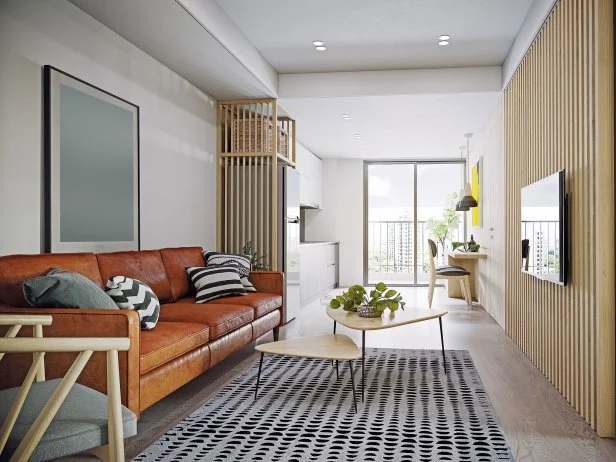
Warm tones such as terracotta or mustard yellow create intimacy in dining areas. They encourage lively conversation and make family meals feel more engaging.
3. Bedrooms for Restful Sleep
Cool tones like soft green or lavender are ideal for bedrooms. They reduce stress and help the mind relax, promoting better sleep quality.
4. Modern Open-Plan Homes
Balancing warm and cool tones in open spaces helps divide functional areas. For instance, warm tones in the kitchen can create energy, while cool tones in the adjacent living area bring calmness.
5. Work-from-Home Offices
Cool tones like muted green or grey are beneficial for focus and productivity, while a touch of warm accents keeps the space from feeling sterile.
Frequently Asked Questions
1. Are warm tones better than cool tones for interior design?
Neither is “better”—it depends on the space and purpose. Warm tones are great for social areas like living rooms, while cool tones are better for restful spaces like bedrooms. A balanced mix often works best.
2. Can I combine warm and cool tones in the same room?
Yes, combining warm and cool tones can create a dynamic yet harmonious interior. For example, pairing warm beige walls with cool blue accents offers balance and visual interest.
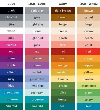
3. How do I know if a color is warm or cool?
Warm tones have red, orange, or yellow undertones, while cool tones have blue, green, or violet undertones. Neutral shades like grey or white can lean either warm or cool depending on the undertone.