How to Choose the Right Furniture Colour for Your Home: Expert Tips and Inspiration
How to Choose the Right Furniture Colour for Your Home: Expert Tips and Inspiration

Selecting the right furniture colour is one of the most impactful decisions you’ll make when designing or renovating your home. Colour not only affects the overall mood and atmosphere of a space but also influences how large, warm, or cohesive it feels. A perfectly chosen furniture palette ties a room together, balancing walls, flooring, décor, and lighting into a harmonious design.
This comprehensive guide will help you understand how to choose the right furniture colour for different spaces, explore real-world product inspirations, and learn practical ways to use colour to your advantage in interior design.
Why Furniture Colour Matters in Interior Design
Furniture colour is more than just a style choice—it defines the visual rhythm of your home. Darker furniture creates intimacy and drama, while lighter shades open up a space and make it feel more expansive. Choosing colours that complement your wall tones, flooring, and décor ensures a balanced and inviting home.
The right furniture colours can also improve functionality. For example, neutral sofas are versatile and easy to decorate around, while bold accent chairs become focal points that anchor the room. Understanding the psychology of colour helps you make decisions that match both your personal style and your lifestyle needs.
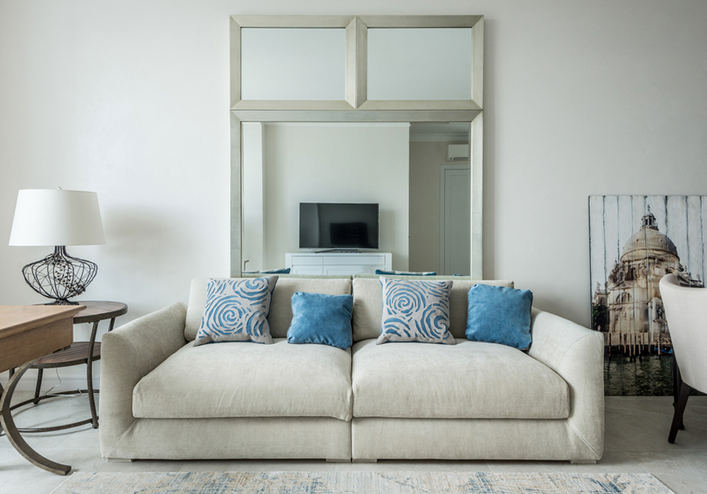
Neutral-Coloured Sofa
A beige or light grey sofa serves as a timeless base for living room design. Its versatility allows it to blend with a wide range of wall colours and decorative accents.
Relevance: Neutral furniture pieces form the foundation of a space, offering flexibility for seasonal décor changes and long-term adaptability.
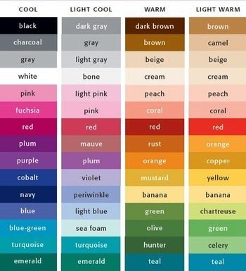
Understanding Colour Psychology in Furniture
Every colour triggers specific emotions, and incorporating this knowledge into furniture selection enhances the mood of your home.
-
White and Beige: Create calm, spacious, and minimalist vibes.
-
Grey: A modern and sophisticated choice that pairs well with bold accent colours.
-
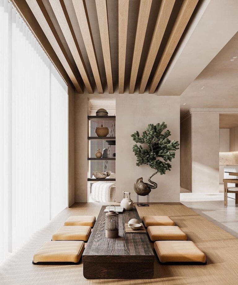
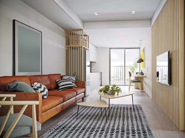
Brown and Wood Tones: Warm, earthy, and grounding, perfect for rustic or traditional spaces.
-
Blue: Evokes calmness and tranquility, great for bedrooms or coastal-inspired interiors.
-
Green: Fresh, natural, and revitalizing, often used to connect interiors with outdoor elements.
-
Black: Sleek and dramatic, best used sparingly to create depth and contrast.
By aligning colour psychology with your lifestyle, you can choose furniture that feels both functional and emotionally resonant.
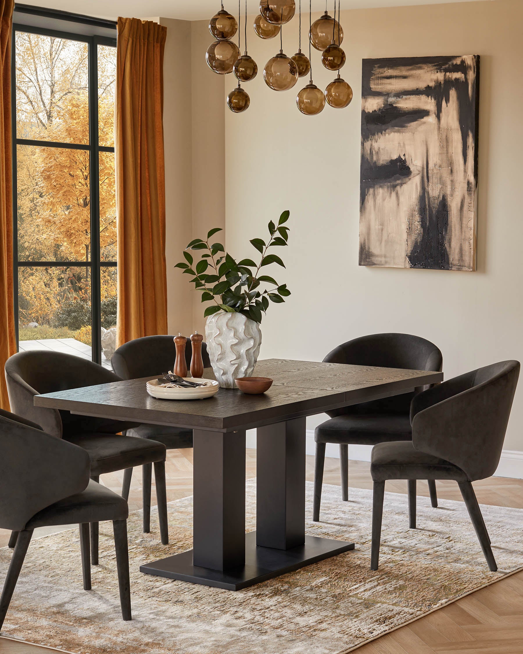
Dark Wood Dining Table
A solid walnut dining table provides warmth and depth, making meals feel cozy and inviting.
Relevance: Wood tones are classic furniture colours that complement both modern and traditional designs, proving colour can influence the overall dining experience.
Matching Furniture with Walls and Flooring
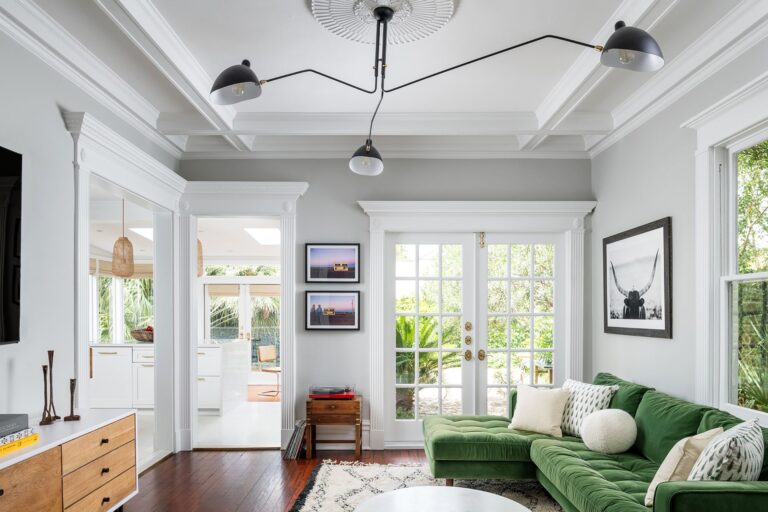
When choosing furniture colours, harmony with wall tones and flooring is essential. Light-coloured walls pair well with darker furniture to create contrast, while darker walls benefit from lighter furniture to balance the mood.
Flooring also plays a role. Wooden floors often pair beautifully with neutral or earthy-toned furniture, while modern tiles work well with sleek greys or blacks. The aim is to create visual flow from top to bottom, avoiding overwhelming combinations.
Insert image of the product
White Marble Coffee Table
This sleek piece pairs effortlessly with darker floors and coloured rugs, acting as a neutral anchor in the living space.
Relevance: Statement pieces like a marble coffee table show how a balanced contrast between furniture and flooring can elevate a room’s sophistication.
The Role of Lighting in Choosing Furniture Colours
Lighting significantly influences how furniture colours appear. Natural daylight enhances true colours, while warm artificial lighting makes tones appear cozier and richer. Cool lighting, on the other hand, sharpens crisp whites and bright shades.
When choosing furniture, always consider how it will look in the actual lighting of the room. Test swatches or bring samples into the space to see how colours change throughout the day.

Philips Hue Floor Lamp
Smart lighting systems let you adjust warmth and brightness, allowing furniture colours to appear differently depending on mood or time of day.
Relevance: Technology-driven lighting enhances the flexibility of furniture colour schemes, showing how lighting and furniture choices go hand-in-hand.
The Role of Technology in Choosing Furniture Colours
Modern technology provides powerful tools for experimenting with furniture colours before making decisions. Augmented reality (AR) apps allow you to visualize how a sofa, table, or chair will look in your space. Online mood board platforms help you curate colour palettes and test how they interact with wall paint or flooring samples.
This prevents costly mistakes, making the process more efficient and less stressful. With technology, you can confidently choose furniture colours that fit perfectly into your design vision.

Houzz Interior Design App
Houzz lets users virtually place furniture into their own rooms and test colour combinations digitally.
Relevance: Digital design tools show how technology is reshaping the way homeowners make furniture colour choices with precision and ease.
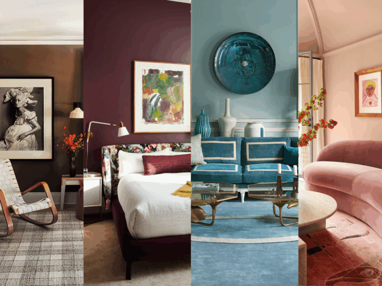
Real-World Examples of Furniture Colour Inspiration
Scandinavian-Inspired Bedroom
A minimalist bedroom featuring light oak bed frames and white furniture creates a serene and airy environment, proving that pale wood tones are perfect for small spaces.
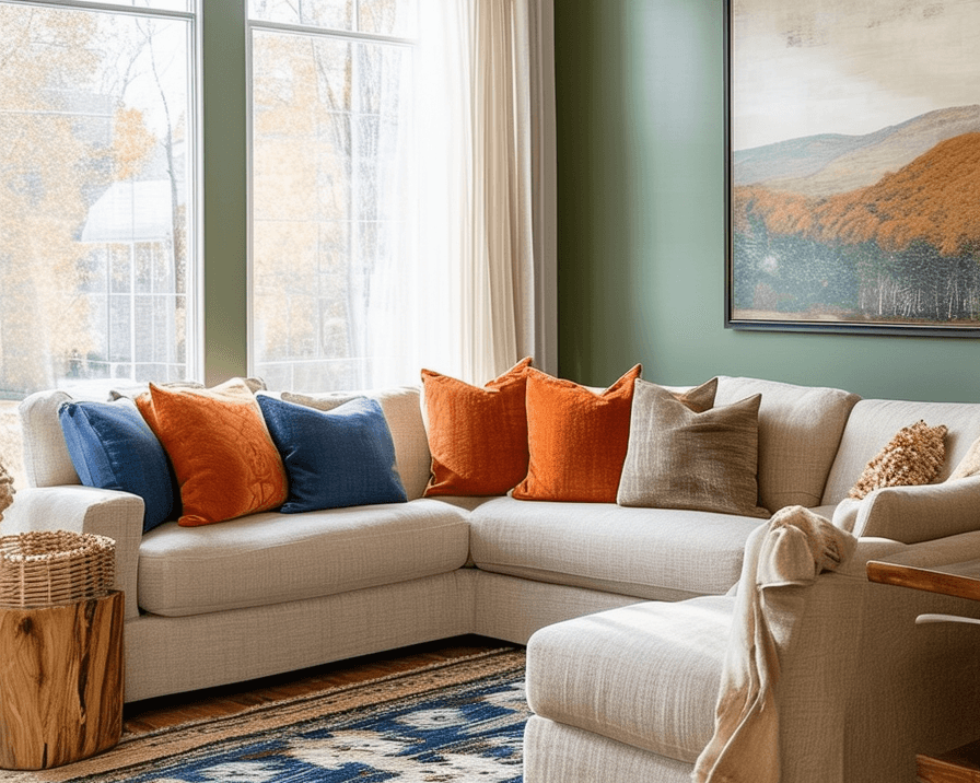
Modern Living Room with Bold Accents
A charcoal grey sectional sofa paired with mustard yellow accent chairs creates a dramatic yet balanced living space, showing how neutrals and bolds can coexist.
Rustic Dining Area
A reclaimed wood dining table with warm brown hues, paired with soft beige chairs, offers a cozy farmhouse appeal while staying timeless.
Contemporary Office Corner
A sleek black desk with a matte finish contrasts beautifully with white walls and greenery, making the workspace feel modern and energizing.
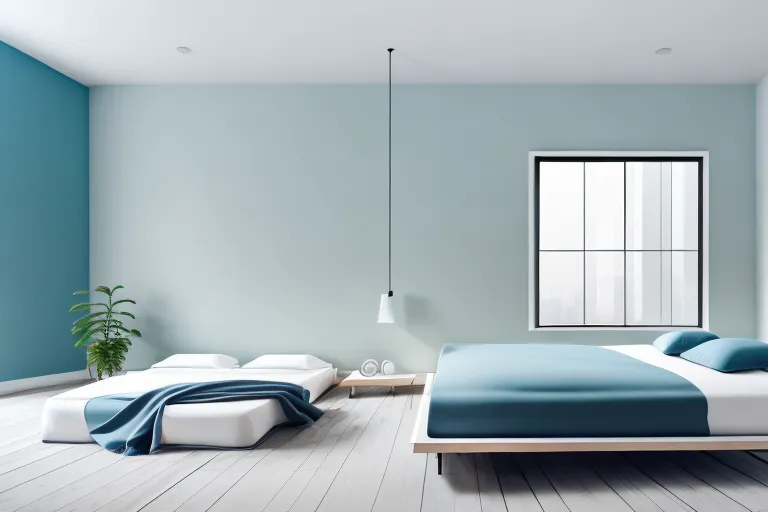
Coastal-Themed Living Room
Soft blue armchairs paired with a white slipcovered sofa and sandy-toned rug evoke seaside calm, ideal for relaxation.
Benefits of Choosing the Right Furniture Colour
-
Cohesion: Creates flow and harmony between different areas of the home.
-
Mood Enhancement: Colours influence emotions, from relaxation to productivity.
-
Timelessness: Neutral or versatile tones ensure long-lasting appeal.
-
Flexibility: Proper colour selection makes it easier to refresh spaces with new accents.
-
Value: Homes with cohesive furniture colour schemes often appear more appealing to buyers.
Real-Life Use Cases
1. Small Apartment Makeover
By choosing a light grey sofa and white shelves, a small apartment looked brighter and larger, solving the issue of feeling cramped.
2. Busy Family Home
A family selected dark brown leather furniture for their living room, making it durable and resistant to stains, while still warm and stylish.
3. Home Office Transformation
Adding a navy-blue office chair and desk accessories created a professional yet calming atmosphere, boosting focus and productivity.
4. First-Time Homeowner
Neutral-coloured furniture was chosen to ensure flexibility, allowing seasonal décor updates without requiring major furniture changes.
5. Rental Space Design
A landlord used beige and grey-toned furniture for a condo unit, creating a neutral and universally appealing space for tenants.
Frequently Asked Questions
1. Should furniture be darker or lighter than walls?
There is no strict rule, but contrast often works best. Lighter furniture makes dark walls feel balanced, while darker furniture grounds light walls.
2. What furniture colour works best in small spaces?
Lighter colours such as white, beige, or pale grey make small spaces feel larger and more open. Pairing them with mirrors and natural light enhances this effect.
3. How do I avoid clashing furniture colours?
Stick to a defined palette of 2–3 main colours. Use one neutral base, one complementary shade, and one accent colour for balance and visual interest.