Best Colour Combinations for Small Apartments: Design Ideas to Maximize Space
Best Colour Combinations for Small Apartments: Design Ideas to Maximize Space

Designing a small apartment comes with unique challenges, and colour plays a pivotal role in how large, bright, or comfortable your space feels. The right colour combinations can visually expand rooms, enhance natural light, and create harmony between living areas. By understanding colour psychology and pairing hues strategically, even the smallest apartment can feel stylish and spacious.
In this article, we’ll explore how to choose the best colour combinations for small apartments, provide real-world design inspirations, explain the benefits of using modern technology in colour selection, and share practical use cases that show how the right palette can solve everyday space challenges.
Why Colour Combinations Matter in Small Apartments
Colour combinations are more than just style choices—they influence how we perceive space. Light colours reflect light, making rooms feel larger, while darker shades can add depth and coziness when used thoughtfully. Pairing complementary tones ensures balance, preventing the space from feeling cluttered or overwhelming.
In small apartments, colour is a design tool that can:
-
Maximize natural light.
-
Define functional areas within open layouts.
-
Add personality without overwhelming the space.
-
Create the illusion of higher ceilings or wider walls.

White and Light Grey Sofa with Neutral Walls
This combination of white walls with light grey furniture provides a crisp, clean backdrop while keeping the space airy.
Relevance: White paired with light grey is a timeless combination for small apartments, enhancing brightness and offering flexibility for accent colours.
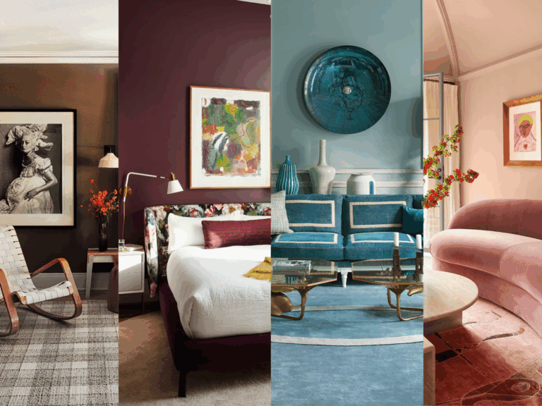
Popular Colour Combinations for Small Apartments
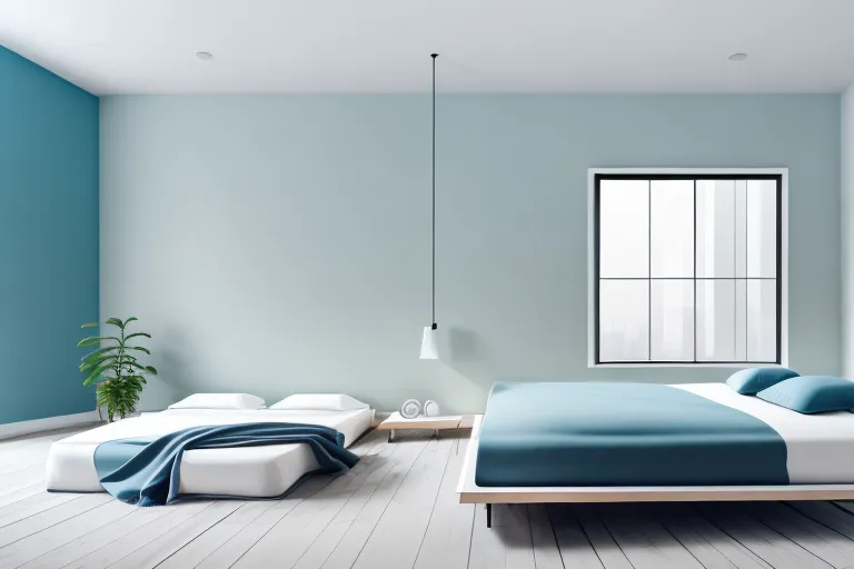
White and Pastel Blue
This pairing reflects light while introducing a calm, serene atmosphere. Pastel blue works particularly well in bedrooms and living rooms, where relaxation is a priority. The subtle contrast ensures the space feels inviting rather than stark.
Beige and Warm Neutrals
Soft beige combined with taupe or light brown creates a warm, welcoming environment. These earth tones work beautifully in open-plan apartments, offering continuity without making the space feel closed in.
Grey and Yellow Accents
Grey serves as a neutral base, while pops of yellow inject energy and brightness. This combination is ideal for small kitchens or dining areas, where vibrancy enhances functionality.
White and Soft Green
Adding soft green to a predominantly white palette brings in a refreshing natural vibe. It’s perfect for small apartments that need a balance of calmness and vitality.
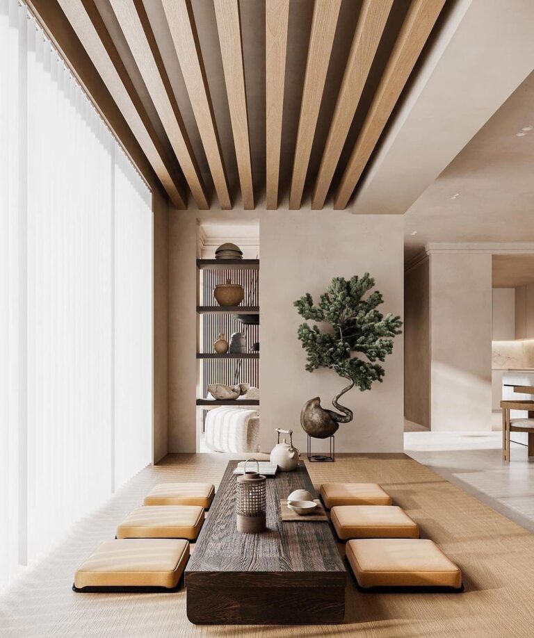
Neutral Tones with Black Accents
Using neutrals like ivory or pale grey with subtle black elements creates sophistication. Black accents in furniture or décor can define spaces without making them feel smaller.

Soft Green Accent Chair with White Walls
A light green chair in a white-walled living room introduces freshness without overpowering the design.
Relevance: Green enhances relaxation while maintaining the airy feel needed in compact spaces.
Real-World Examples of Colour Combinations
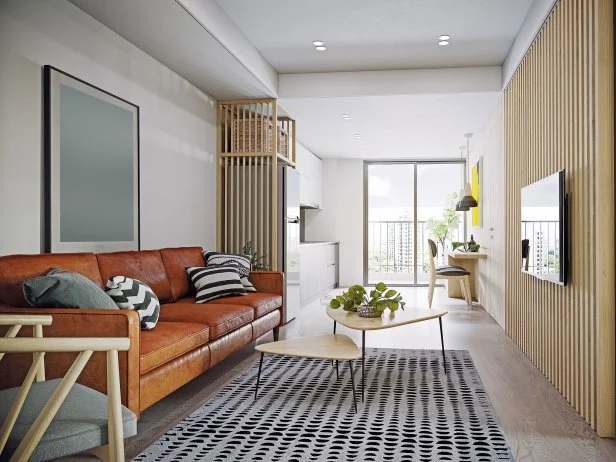
Scandinavian-Inspired Studio
A palette of white walls, light wood flooring, and beige furniture creates a minimal, spacious look. Pops of pastel pink and grey cushions add personality without clutter.
Modern Grey Apartment
Light grey walls combined with white cabinetry and dark grey textiles provide a cohesive, modern aesthetic. Accents of teal artwork brighten the space without reducing openness.
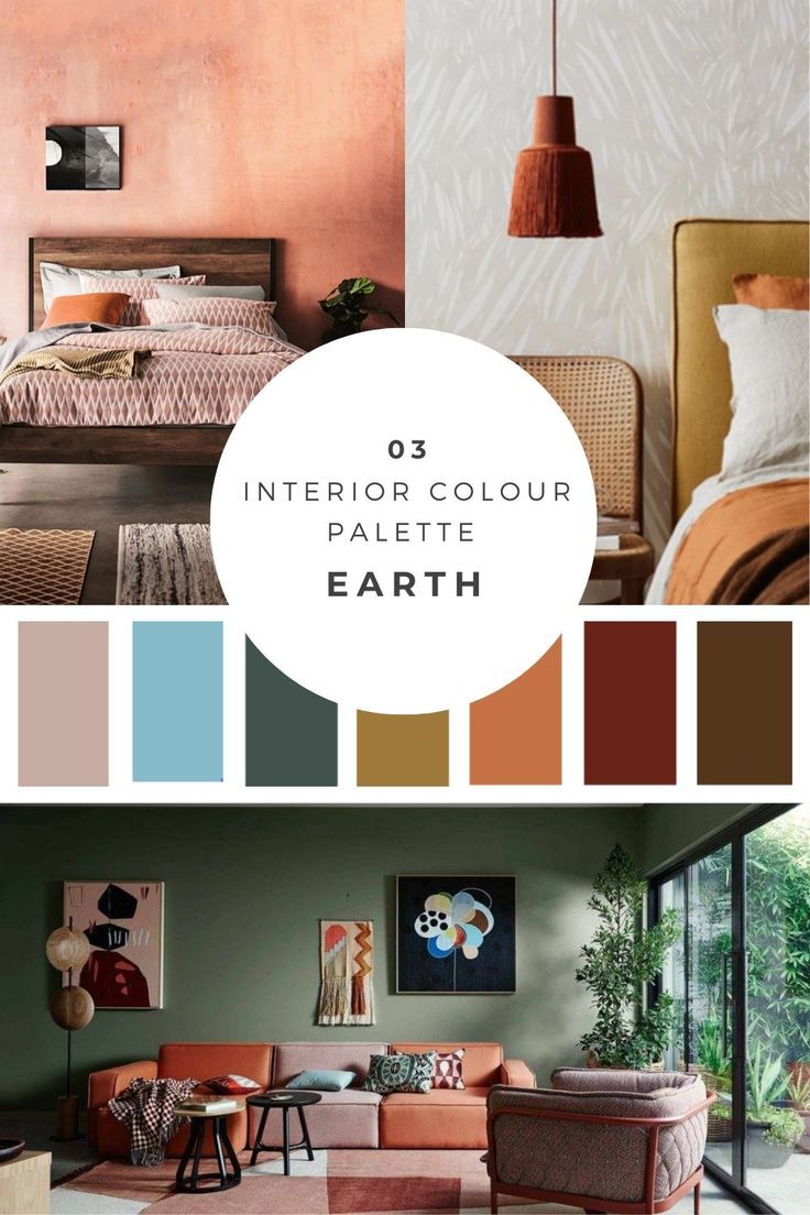
Earthy Minimalism
Beige walls paired with natural wood furniture and olive-green décor create warmth. This palette reflects nature, making even small apartments feel grounded and inviting.
Coastal-Inspired Small Living Room
White walls with light blue accents and sandy beige furniture bring a breezy, coastal vibe. This colour combination amplifies light and makes the space feel larger.
Bold Accent Approach
Neutral ivory walls with a single dark navy accent wall create depth while maintaining openness. Paired with white and wood furniture, the design balances boldness and spaciousness.
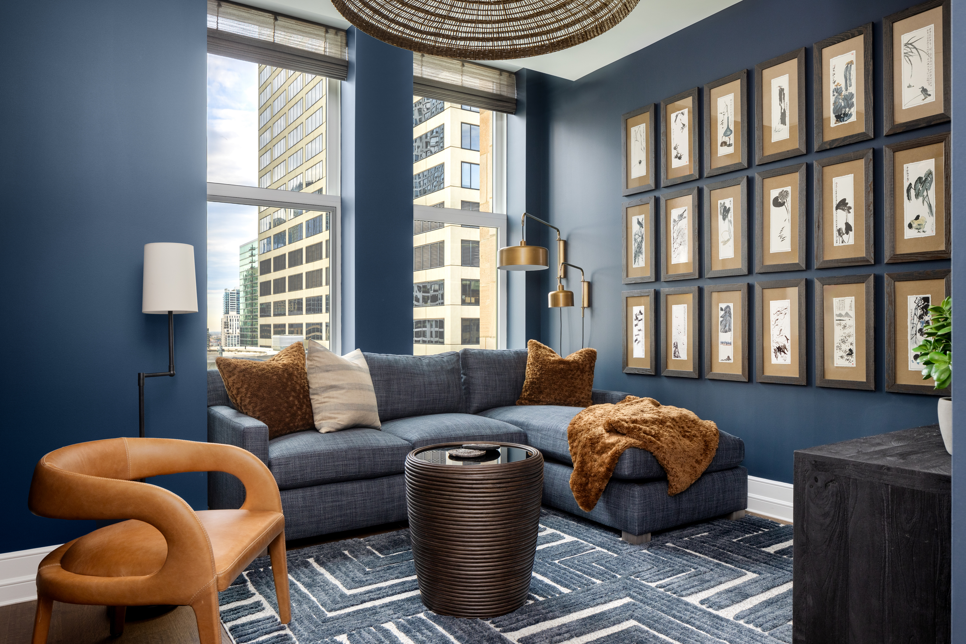
Navy Accent Wall with Neutral Décor
A navy feature wall paired with light wood furniture adds depth without overwhelming the room.
Relevance: Darker accent colours can define space in small apartments when balanced with lighter tones.
How Lighting Affects Colour Combinations
Lighting dramatically influences how colour combinations appear in small apartments. Natural light enhances soft, airy colours, while artificial lighting can alter tones.
-
Warm lighting complements beige, soft green, and pastel hues, making the space feel cozy.
-
Cool lighting enhances grey, white, and blue, giving a crisp, modern finish.
-
Smart lighting allows flexibility, letting homeowners adjust ambience based on time of day or activity.
When selecting colour combinations, always consider the natural light available and test shades under different lighting conditions.
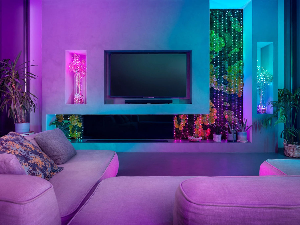
Smart LED Lighting in a Small Apartment
A smart lighting system allows residents to enhance their chosen colour combinations for different moods.
Relevance: Lighting enhances or diminishes the effectiveness of colour palettes, making technology a vital tool in design.
The Role of Technology in Selecting Colour Combinations
Today’s design technology allows homeowners to experiment with palettes before making final decisions. Tools such as digital mood boards, augmented reality (AR) apps, and virtual painting tools help visualize how combinations will look in real spaces.
-
AR apps let you see how walls appear in different shades instantly.
-
Mood board platforms help create harmonious palettes with furniture and décor.
-
Lighting simulations allow homeowners to test how colours interact with natural and artificial light.
This ensures confident decisions, avoiding costly repainting or redesigning mistakes.
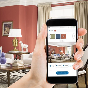
Paint Visualizer Tool
A paint visualizer tool lets homeowners test multiple colour combinations directly on digital room images.
Relevance: Technology simplifies experimentation, allowing people to select the most space-enhancing palettes for their apartments.
Benefits of the Right Colour Combinations
-
Illusion of Space: Light and balanced colours make small apartments feel larger.
-
Improved Comfort: Harmonious palettes create emotional well-being and reduce visual clutter.
-
Style Consistency: Colour combinations define themes—modern, cozy, minimalist, or vibrant.
-
Increased Functionality: Different colour zones can separate living, dining, and sleeping areas in open-plan apartments.
-
Timeless Appeal: Well-chosen palettes remain stylish for years, reducing the need for frequent changes.
Practical Use Cases
1. Open-Plan Studio Apartments
Using neutral combinations with accent colours defines different areas without physical dividers, maximizing space efficiency.
2. Small Bedrooms
Soft pastel shades paired with neutrals create a calm environment while visually enlarging the space.
3. Compact Kitchens
Grey and white combinations with bright accents like yellow enhance light reflection, making kitchens feel less cramped.
4. Rental Apartments
Tenants can use versatile palettes like white and beige to maintain style while easily incorporating temporary accent colours.
5. Family Apartments
Soft greens and blues paired with neutrals create a soothing, family-friendly environment that avoids overwhelming the senses.
Frequently Asked Questions
1. What colour combination makes a small apartment look bigger?
Light colours such as white, soft grey, or beige paired with subtle pastel or muted accents make spaces feel more open and expansive.
2. Can I use dark colours in a small apartment?
Yes, but use them strategically. Dark colours work best as accent walls or in furniture to add depth while balancing with lighter tones.
3. How can I test colour combinations before painting?
Use digital paint visualizers, mood board apps, or AR tools to see how different palettes look in your space under varying lighting conditions.